
project timeline
media
Painted Here
Hello! I'm Jenn, User Experience designer and artist. I'm an expert in designing software for scientists. I've spent
my ten-thousand+ hours working on tools to enable scientific research. I care a lot about open
education, and
creating accessible digital infrastructure.
You can learn about my design process by listening to my ADASS talk,
Empowering Science with Good Design.
Since 2017 I’ve led UX at
MAST, a NASA data archive for
space telescope missions like Hubble, Webb, and Roman. I’ve given a handful of talks and my work has been highlighted in some exciting and fun places.
I also paint, write, do user research, create logos, animations—if there's an art thing I've probably
tried it once.
I am the first designer to work at MAST, a data archive for NASA space telescopes. The archive was
composed of many search forms that looked like they were built in the 90’s by scientists. (They
were, and they were!) These forms had different design patterns, both visually and for completing
tasks—there was much unnecessary complexity. Science workflows are often complex, but they shouldn’t
be made even more complex!
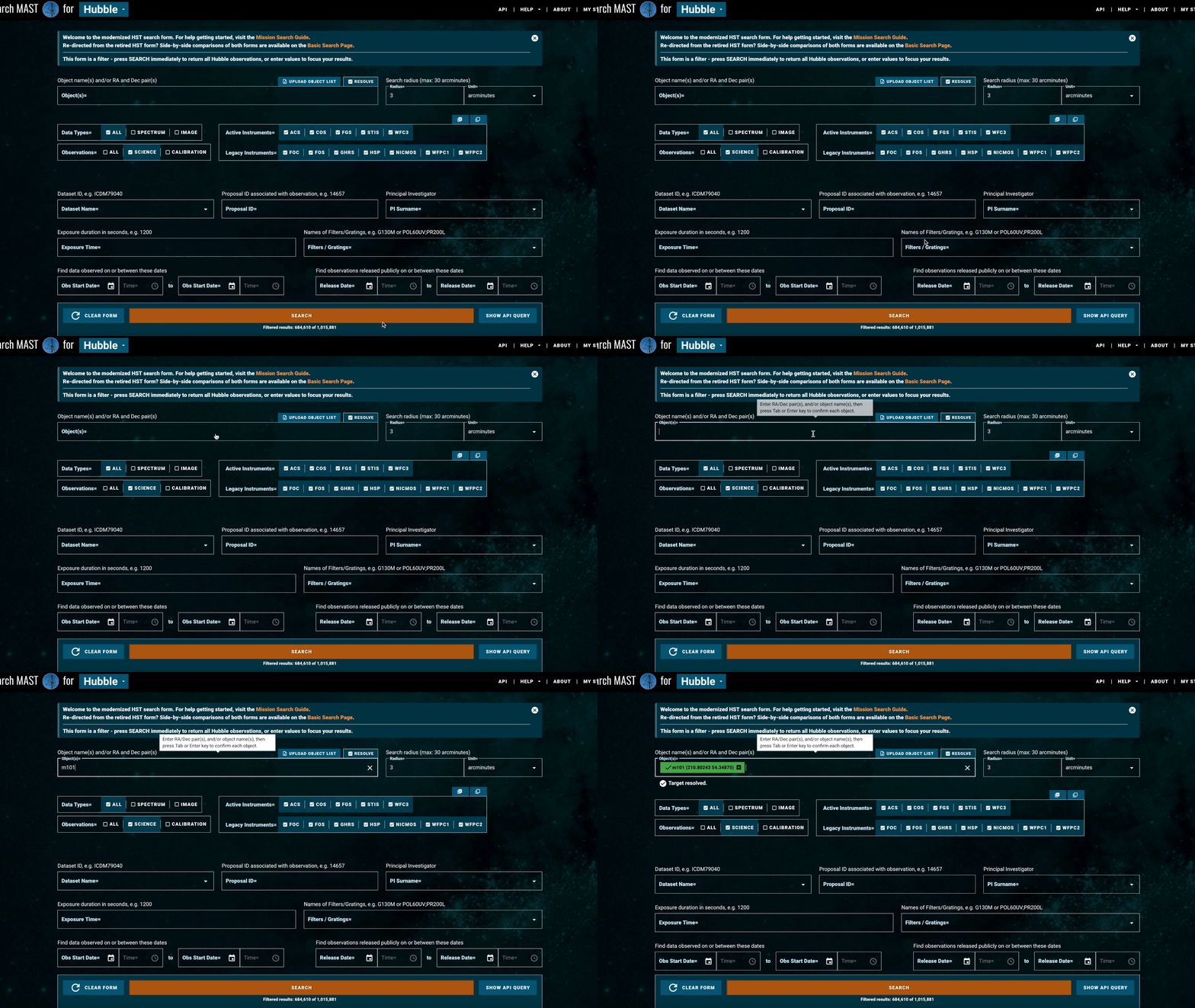
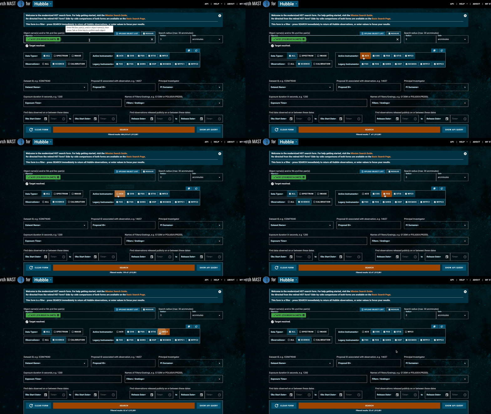
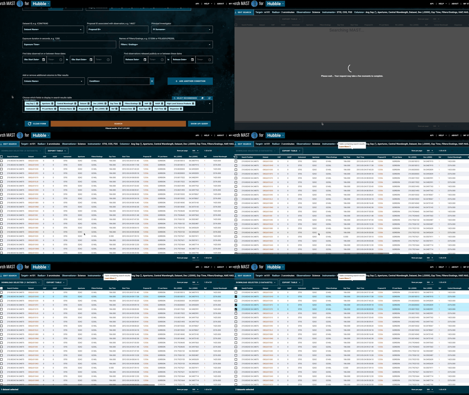
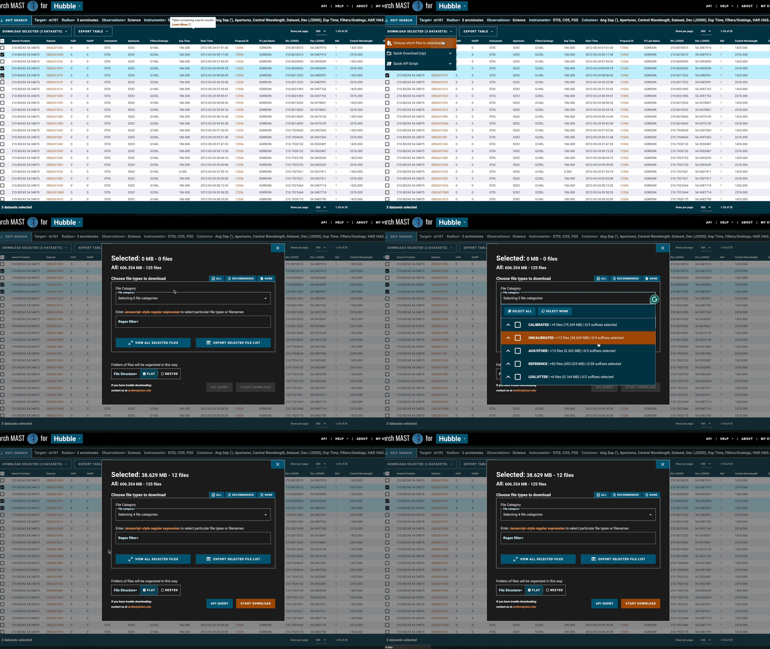 Over several years, I have designed a system of cohesive components to use across MAST’s many
searches. I have established common workflows that are repeated in different contexts. Now, MAST
searches are a part of an interconnected system. Scientists who are familiar with one can easily
swap to another, making them easier to learn and use. I continue to expand and interconnect this
system as new telescope missions are added to our archive.
Over several years, I have designed a system of cohesive components to use across MAST’s many
searches. I have established common workflows that are repeated in different contexts. Now, MAST
searches are a part of an interconnected system. Scientists who are familiar with one can easily
swap to another, making them easier to learn and use. I continue to expand and interconnect this
system as new telescope missions are added to our archive.
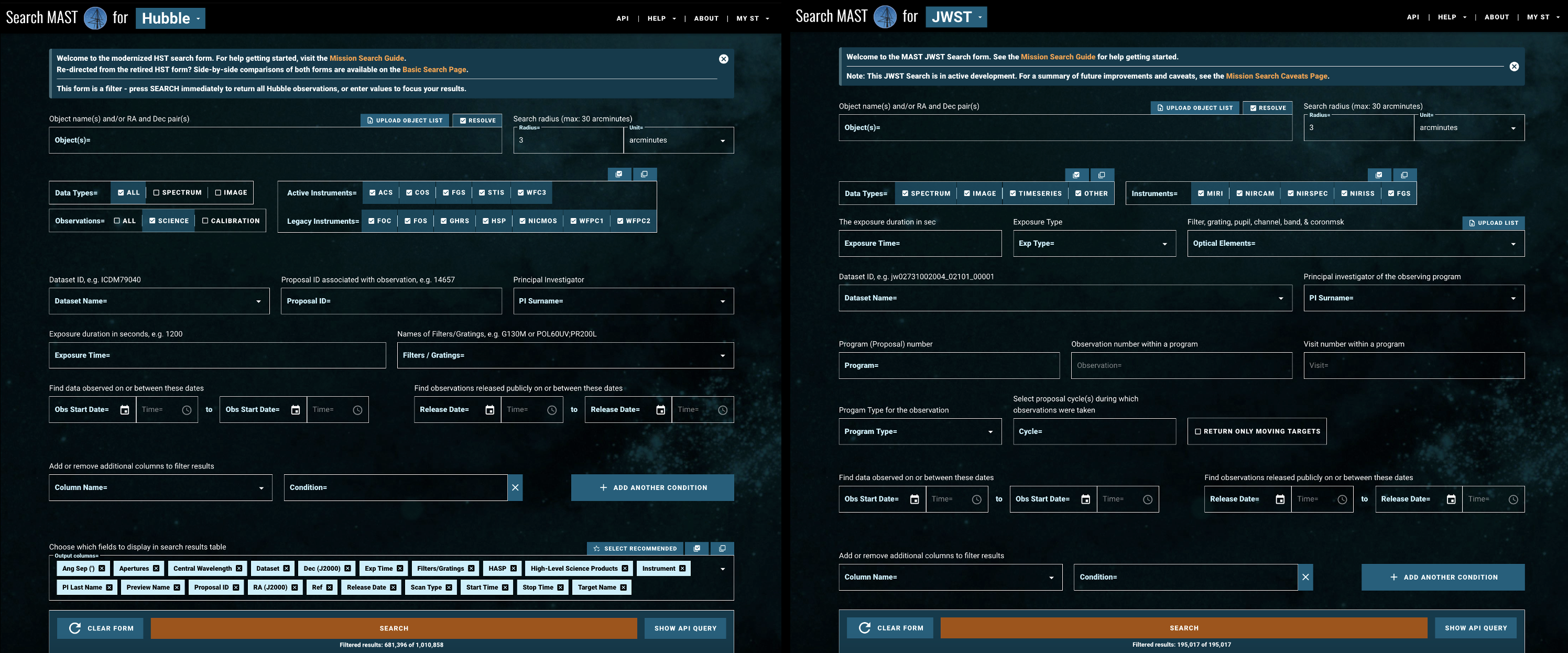 This has been a complex, multi-year project, involving many stakeholders: developers, project
scientists of different backgrounds, mission leads, and the astronomers who use MAST to conduct
their research.
This has been a complex, multi-year project, involving many stakeholders: developers, project
scientists of different backgrounds, mission leads, and the astronomers who use MAST to conduct
their research.
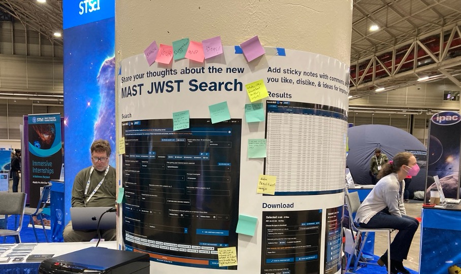
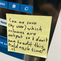
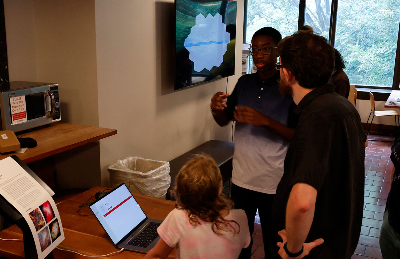
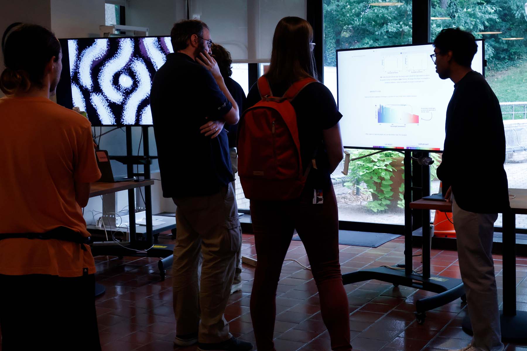
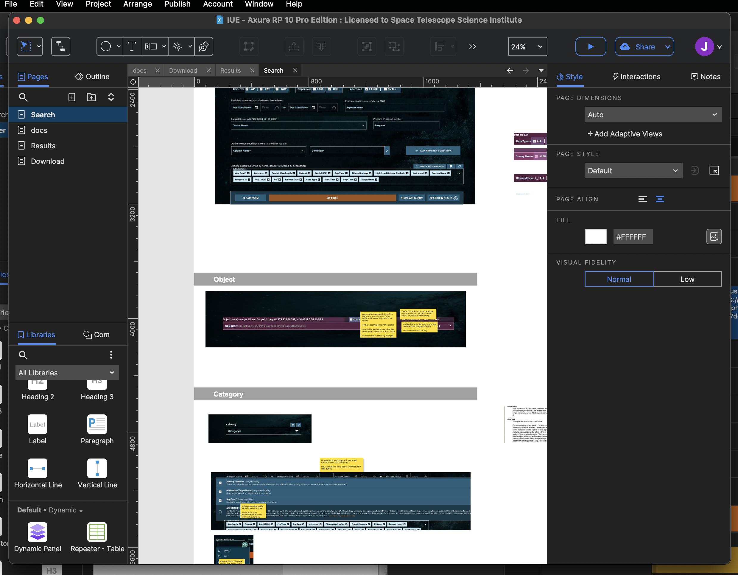 I have stayed focused on our core users: research astronomers. I have led design workshops and gone through iterative rounds of feedback with scientists. I've run usability tests, created surveys, reviewed helpdesk requests, and even tried experimental methods like interactive conference posters.
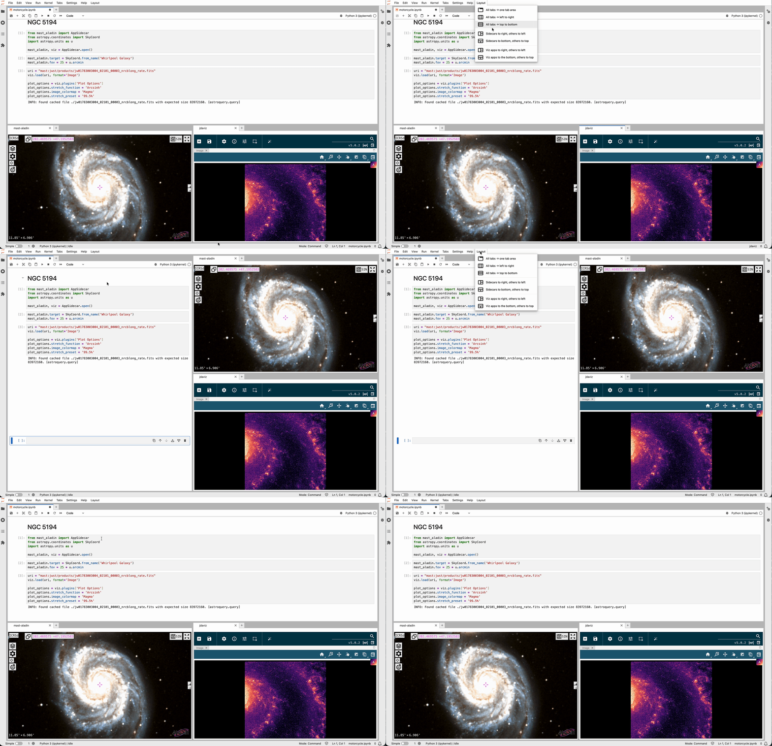
Jdaviz is astronomical data analysis and visualization tools based on the Jupyter platform. These
add a UI interactive layer to computing notebooks. They are designed to work within a Jupyter
notebook cell, as a standalone desktop application, or as embedded windows within a website.
For this project I have consulted with the team of developers and scientists on adding features and
streamlining existing features. I have designed logos and icons and led usability feedback sessions.
With the extremely high volume of data coming from telescopes like Roman, more scientists will need to use Jupyter environments. We built a series of interactive widgets for Science Notebooks. These widgets help to give science notebooks more non-code interactive options like a skyviewer and Jdaviz tooling, and they combine with python in powerful ways. This enables cool new research workflows that were not possible before.
For this project I advised on UX, ran usability feedback sessions, and provided icons.
Jupyter Notebooks play a central role in modern data science workflows. Despite their importance,
these notebooks are inaccessible to people who rely on assistive
technology like screenreaders. Impacted users must find extreme workarounds or give up using them entirely. Students
with disabilities have reported leaving their field once they learn their chosen career’s
foundational tools are inaccessible to them. I led a multidisciplinary team to try to solve this problem.
I gathered a team of people with
different backgrounds and skills. We wrote a killer grant proposal and was awarded and
administered a 6-figure grant. Notebook accessibility is a super thorny problem and we did not solve
it, but we did make progress!
My part of the project was collaboratively writing and conducting
usability tests with people who use assistive technology. We did two rounds of usability testing on
Content types, structure and navigation.
The scripts and results are all publicly available.
Based on the feedback we gathered, our developers experimented with an improved notebook html
output. Our lead developer Tony Fast has continued working on this in his project nbconvert-a11y. We also established best practices for writing notebooks accessibly. We condensed this
information into an accessibility checklist that people building notebooks can reference.
As part of this grant we organized public events: Accessible Notebook Hackathon and Day of
Accessibility, and presented our results at Jupytercon 2023 to try to gain awareness and get more
people working on this problem.
Astronify is a python package that sonifies--turns to sound--astronomical data. I was a core member of a small team awarded a grant to pursue this experimental work.
I led the usability testing of the sonifications. This was an adventure through uncharted jungle,
exploring user-patterns that aren’t well established. We focused on how
sonification could be useful for scientific research—they needed to be interactive and convey
meaning that could be used by a scientist, not simply tell a story. This is fundamentally different than a curated
sonification for the general public. I worked with GLAS education to connect with blind and low
vision technologists who I met in one-on-one sessions to gather feedback. I also used gamified surveys to
gather asyncerous feedback. People play a game trying to identify meanings within
sonifications, and based on their answers, we learned if the information in the sonification was
discernable.
I also led community outreach. I created a series of videos explaining sonification and astronomy concepts to
an amateur audience. For these videos I wrote and recorded the script, edited the recordings, came
up with a visual language that would be the most visible for low vision audience, and animated the
videos. The videos were featured as a learning resource on the Perkins School for the Blind website. I connected with the NPR show Out of the Blocks which featured
Astronify. I presented the an astronify gameshow at a sonification festival and conferences
internationally.
I collaborated with Iota School to organize this event. We gathered people working in science and tech to engage with the challenges around making science and tech inclusive. Through a series of talks and hands on learning activities.
Attendees learned about accessibility challenges in STEM, and will left prepared to act as
accessibility advocates in their work. All talks and slides are publicly available.
Our keynote was given by Joshua Miele, a MacArthur fellow and leader in adaptive technology design. Science
writers talked about best practices in astronomy alt text, the notebooks for all team
spoke about Jupyter Notebook accessibility, and Dr Scott Fleming spoke about data sonification.
Dr Patrick Smyth of Iota School a hands-on workshop to learn the fundamentals of using screen readers.
We had interactive tactile exhibits on display. We were pleased to welcome a diverse audience
including a large cohort from the Baltimore School for the Blind.
I collaborated with Iota School to organize this interactive hack event for Jupyter Notebook authors. We started with a talk explaining accessibility issues with notebooks—they don't read well on screenreaders—and practical tips for making notebooks more accessible. Then, atendees spent an hour applying what they learned in a notebook they were working on. We ended by gathering as a group and sharing our results.
I was invited to run a similar event at Rubin Observatory.
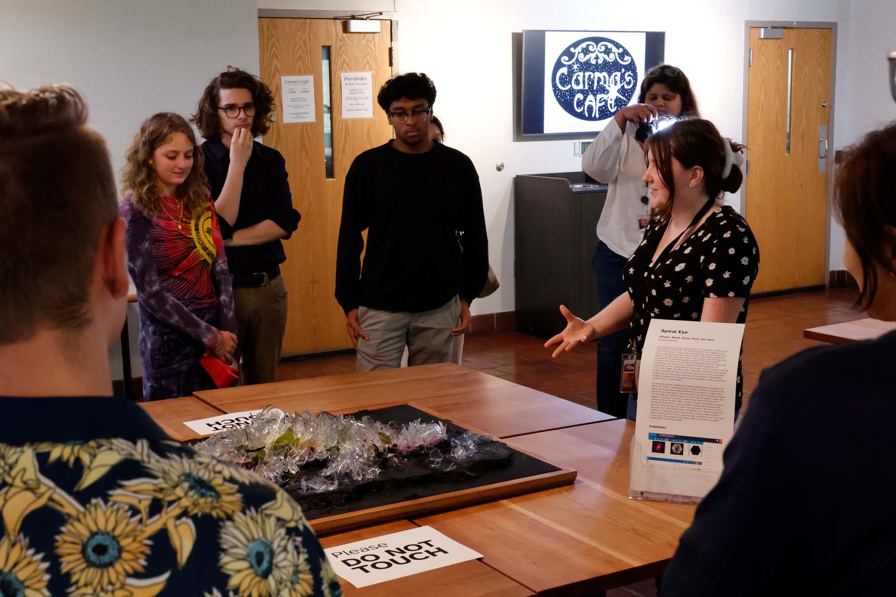
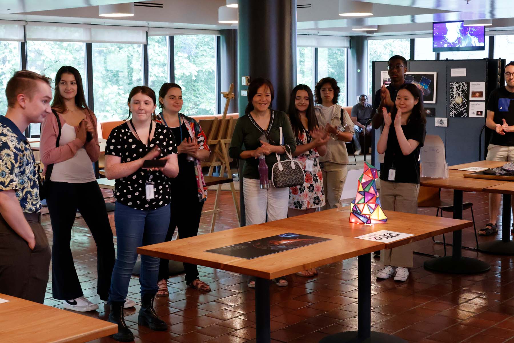
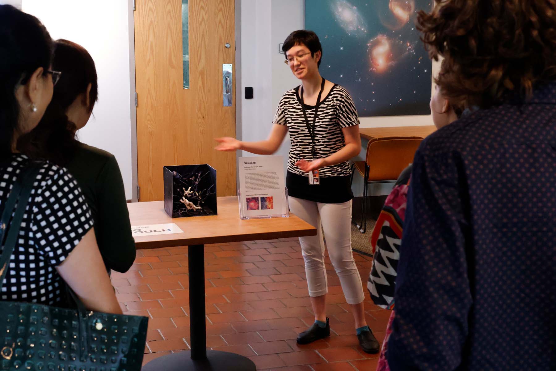
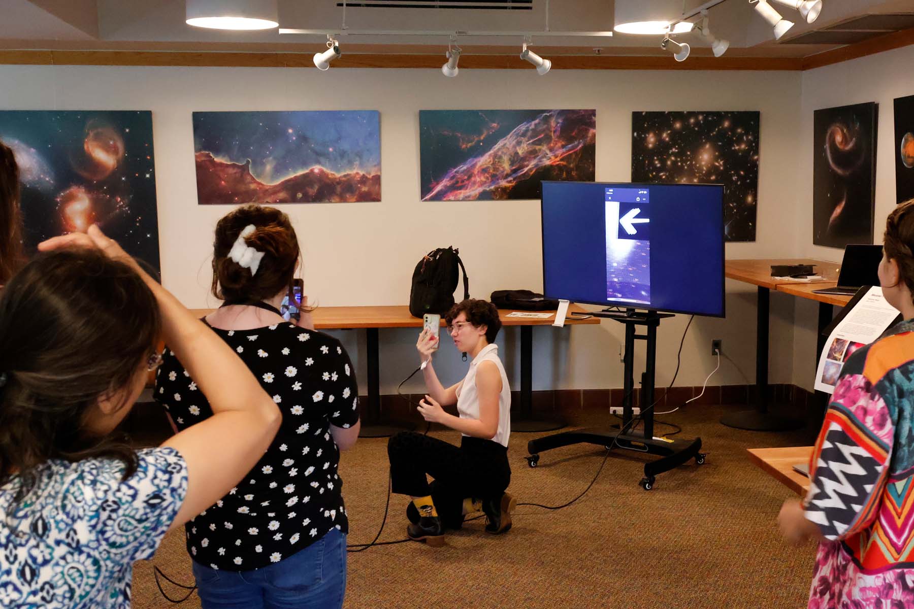
I envisioned, found funding, and organized this paid internship program for high school artists.
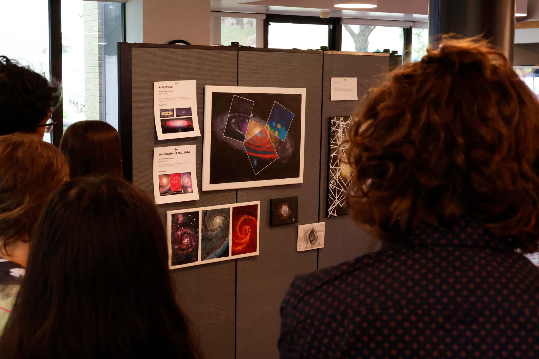
Each student creates art inspired by astronomy data in the medium of their choice. We had students
create paintings, sculptures, music, animations, and augmented reality apps. I collaborated with
colleagues to run the program.
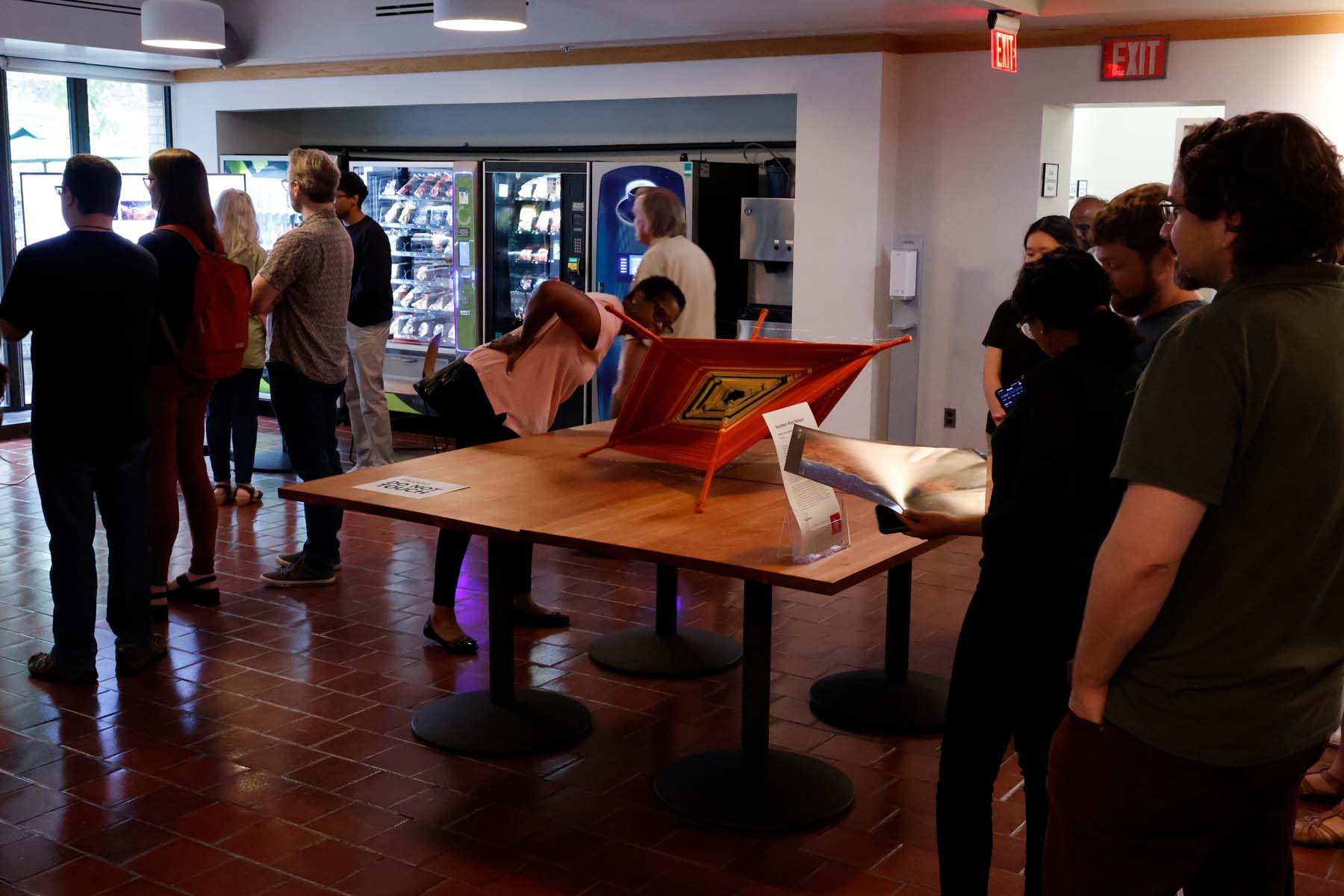
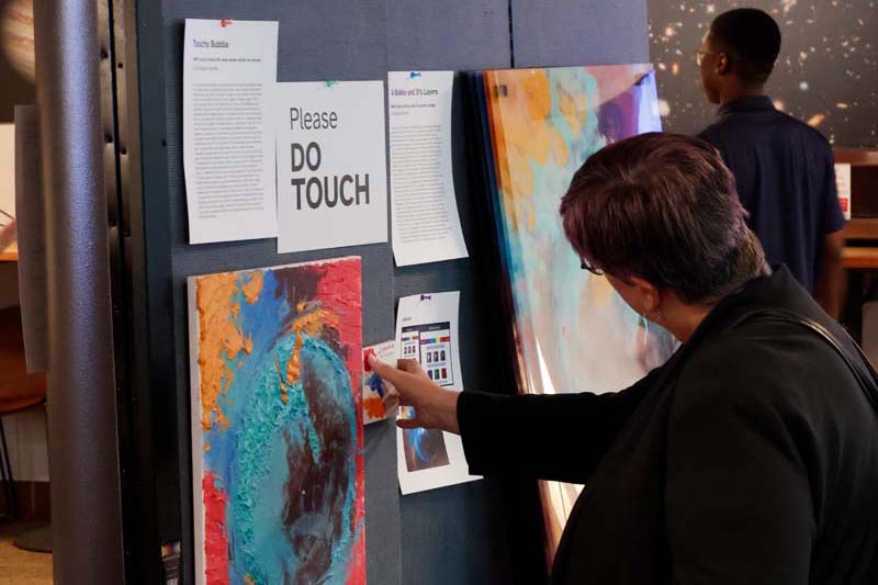
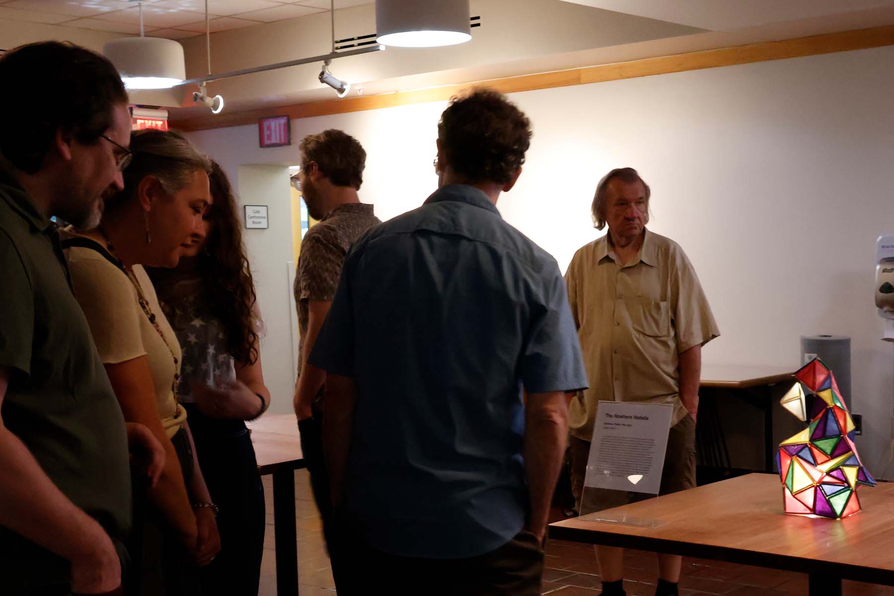
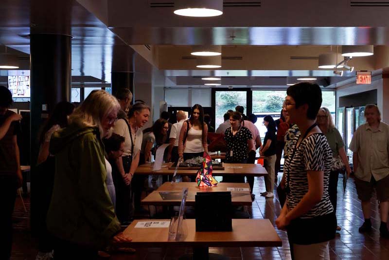
In 2023 We hired a cohort of 12 interns from Baltimore to create art inspired by astronomy data. The program was 6-weeks and the interns worked 10-15 hours a week. We met in
person at Space Telescope Science Institute once a week for 2.5 hours. Alongside time creating
artworks, the students met MAST scientists, wrote a weekly progress journal, participated in
educational talks, and visited James Webb mission control. We ended with a gallery show at STScI
which was widely attended and well enjoyed.
In 2021 We hired students to create art inspired by space sonification that was accessible by a
blind audience. We met by video chat for 6 weeks. The student artists were both blind and sighted
themselves—so we had a lot of interesting discussions about accessibility and art.
Using historic census data from 1790 - 2020, I explored data Baltimore population through
sonification. The final recording and the notebook I used to generate the files are available on
Github.
In Baltimore there is palpable tension between the city and the county. Even the name. Baltimore
county refers to itself as Baltimore and to the city as Baltimore city. City people call the city
Baltimore and Baltimore County is just the county. (With a air of distaste on both sides) They fight
over the name Baltimore itself.
I started by visualizing the information on a graph using Excel to find out if I could see the story
before I listened for one. I only had data until 2010, so I found the most recent census to complete
the set. It was challenging to find that, for a minute I thought I would have to come up with the
number by adding all the populations of different jurisdictions in the county, but luckily
I found the data I was looking for.
I used Astronify to
generate the sonifications. It is meant to be used with lightcurves, but I knew it would work as
long as I had a list of numbers.
I created a Jupyter notebook and pulled in the census data I created a table that Astronify could
use to sonify. Then I generated separate sonifications representing the city and the county’s
population data. I could hear something that I hadn’t noticed when inspecting the data visually.
There were 3 main sections of differing trends.
Since the sonification by itself is not self-explanatory, I decided to write a script and use that
as an opportunity to focus on those 3 section trends. I recorded a few takes of myself reading the
script. Then edited the recording and sonification together in Audacity.